Good morning bloggers!
So a fun little tutorial on using the treat bag framelit from Stampin' Up!
First off, I am mixing my own custom spritz. I love the SU spritzers, they add nice detail to a project. To do this, I have mixed 10 drops of bermuda bay ink with rubbing alcohol and lumiere. You can skip the lumiere if you don't have it, and if you are using any of SU's masks except the stripes, I actually suggest you do as it will dry almost instantly and not bleed under the mask. If you do use lumiere, it gives a lovely metallic sheen but be aware to WASH YOU R MASK IMMEDIATELY after, as I discovered--Lumiere is a PAINT and will dry and STICK on your mask. SU spritzers are around $5 for a 2 pack, so they are very affordable (and the masks are $4). An inexpensive way to add polish!
Lay the mask over your paper. In this case, its my card. Spritz as much or little as you want. For my stripes, I wanted them bold so I went crazy.
Voila, the white card stock is now striped!
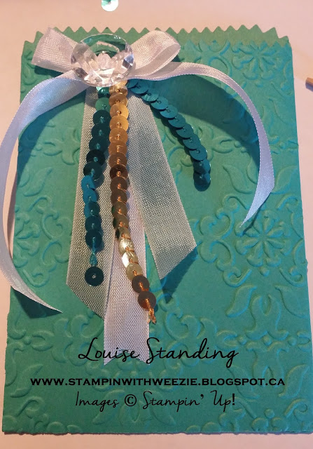
Next, my treat bag holder for fancy presentation. I ran the die cut through the big shot to cut the pieces (using Bermuda Bay card stock). I then embossed just the front with a folder:
Here are the pieces now, ready to decorate.
For the folder, I used sticky strip since it's thick card stock. Not much else will hold it together! As you can see, I'm playing with my layers. I've got seam binding in a coule of colors (white and soft sky or baja, its old and I cant recall which it is) and the sequin trim in gold and bermuda. I am using one button, which I threaded more seam binding thru by cutting the ribbon super pointy on the end and getting my 6 year old to grab it with his sweet little fingers. If he hadn't been around, I would have used tweezers.
I tied it in a bow and flipped it over to glue down, so you still see the shimmery button.
Here are all the layers put together. I stuck a greeting on the front bottom right, but I just didn't like it so I took it back off.
For the card, I used the labels framelits and cut one in white and one in bermuda bay. The bermuda one I cut in half and layered on the back. The image is from Big news and is super cute. I added the extra sequins that fell off as I was working with it. I put it diagonal because it was just a HINT too wide, but I really like it. It works well with the stripes.
And here is the finished ensemble:
I hope you enjoyed today's bonus mini tutorial, I must confess my ADD afflicted mind was getting BORED of all the Paper Pumpkin, as fun as it is. I just have a short attention span and flit around much like a butterfly from project to project! One day they really will tell me I'm ADD!
Back to Paper Pumpkin tomorrow. Please share your comments, and thanks for reading. I must confess I'm so excited to see all my page views, which wouldn't happen without you all checking in so thanks so much! And if you need any product, please call or email me or just click my chop button and we'll get you hooked up with great stuff--Also, it's not too late for the June promo! If you want over $100 of stuff, sign up as a demo instead (no obligation to do anything, as most are just hobbiests). For $125 you get to pick all your stuff in your kit as well as 2 free stamp sets of any value (this is the special, and you can choose even the $50 and $60 sets!). Something to think about.
Have a great day!


No comments:
Post a Comment